The colours you choose for your restaurant furniture do more than just look nice — they set the tone for the entire dining experience. Whether it’s a cozy breakfast spot or an upscale bistro, the right palette can subtly influence how guests feel and even how long they stay. Colour has a surprising impact on mood and appetite, making it a powerful tool when creating the perfect ambiance for your space.
Using contrasting tones, such as black and white or soft colors with strong accents, is one of the most beautiful color schemes for restaurant furniture. A modern café might lean toward sleek and bold, while a rustic eatery calls for something softer and more natural. The right mix of hues can help you tell your brand’s story before guests even look at the menu.
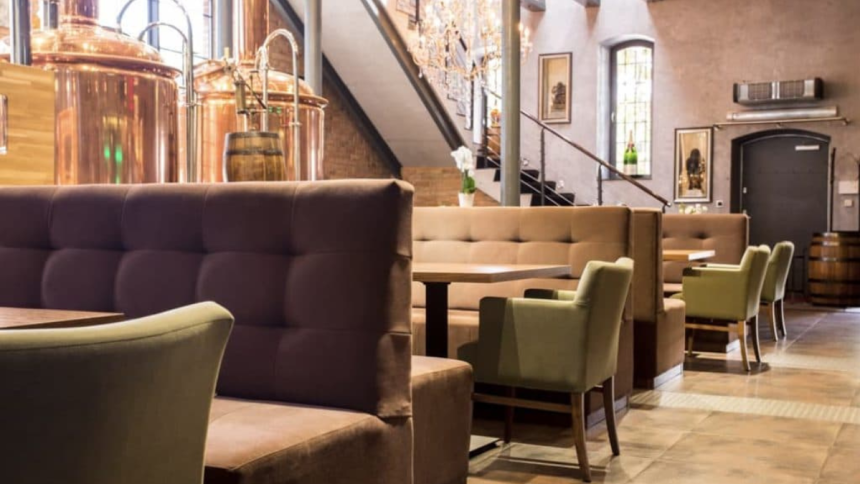
Comfort Through Simplicity
If your goal is to create a space that feels relaxed and welcoming, warm neutrals like beige and light brown are excellent choices. These tones have a comforting quality that puts guests at ease, making them ideal for casual environments. Beige, in particular, works wonderfully with natural materials like wood or stone, adding to the homey feel.
This colour scheme is well-suited for countryside cafés, brunch spots, and diners that want to emphasize comfort over flash. Try mixing beige with olive green, white, or soft brown to keep things grounded and earthy without feeling bland.
Colours That Spark Energy
For livelier spaces, colours like red or mustard yellow can energize the room and spark the appetite. Red, for example, has long been associated with energy and hunger, which is why you’ll often see it used in fast food or casual dining chains. But it can easily become overwhelming, so it’s best used as an accent — think chair backs, bar stools, or feature walls.
Yellow and orange also add warmth and cheerfulness without going over the top. These colours work well in modern cafés or family-friendly spots, offering a playful vibe while keeping things visually interesting.
Sleek Tones for Upscale Spaces
For restaurants aiming for a sophisticated edge, darker tones like black or charcoal grey deliver a sense of elegance and modernity. Black furniture can make a bold statement and works beautifully in high-end environments when paired with gold or rich wood tones.
Grey, on the other hand, is a more versatile option for minimalist or industrial-style spaces. It gives a polished, contemporary look and pairs well with brighter colours like deep blue, mustard, or burnt orange to keep the room from feeling too sterile.
Bringing the Outdoors In
If your restaurant leans into themes of health, sustainability, or farm-fresh food, greens and browns are your best bet. These colours connect guests to nature and evoke calm, especially when used in tandem with natural textures like reclaimed wood or linen fabrics.
Soft greens feel peaceful and clean, while darker shades like forest or olive green add depth and richness. Brown, especially in wood furniture, brings warmth and authenticity that works in nearly any setting — from coffee shops to traditional family diners.
By being intentional with your furniture colours, you can craft an experience that resonates with guests long after their meal. The goal is balance: colours that support your concept, reflect your values, and most importantly, make your customers feel good.
Lynn Martelli is an editor at Readability. She received her MFA in Creative Writing from Antioch University and has worked as an editor for over 10 years. Lynn has edited a wide variety of books, including fiction, non-fiction, memoirs, and more. In her free time, Lynn enjoys reading, writing, and spending time with her family and friends.