In the world of design, perfection is often considered the goal — clean lines, balanced grids, symmetrical faces. But in reality, the things we remember most are rarely flawless. They’re often strange, a little unsettling, oddly proportioned. One perfect example of this? Labubu, a cult character from the Pop Mart universe that has gained international attention not because it fits traditional beauty standards, but because it breaks them.
With its jagged teeth, uneven ears, and expressive (often anxious) face, Labubu is a masterclass in how asymmetry and visual tension can create emotional resonance — and memorability.
The Allure of the Unbalanced
Why symmetry comforts us — and asymmetry sticks
Cognitive psychology has long shown that humans are hardwired to find comfort in symmetry. It signals health, predictability, and even trustworthiness. That’s why most branding, interfaces, and product designs aim for balance and visual order.
But there’s a catch: perfect symmetry is easy to ignore. It’s the offbeat — the object that makes your eye pause — that we remember. Slight distortions or visual friction create what designers call “cognitive stickiness.” Our brain pays more attention, trying to resolve the inconsistency.
Labubu leans fully into this. Its facial structure is never quite centered. One ear may bend forward, the other not. Its eyes aren’t mirrors of each other, and the mouth often looks mid-expression. This “designed disorder” triggers emotional curiosity. We want to know what this creature is feeling — or even what it is.
Designing Emotion Through Imperfection
Labubu as emotional UX in physical form
Good UX uses micro-interactions to create human-like feedback. Think of a button that jiggles when pressed, or a modal that closes with a sighing animation. These subtle imperfections feel alive. They create empathy.
Labubu does the same, but as a three-dimensional character. Each version — from plushies to pendants — carries different micro-details: a furrowed brow, a slightly different tooth line, a shift in posture. These deviations from symmetry don’t break the character; they build its emotional range.
Where other toys aim to be cute or neutral, Labubu dares to look uncomfortable. And that discomfort, like a cracked voice or an awkward silence, feels deeply real.
Kasing Lung and the art of flawed design
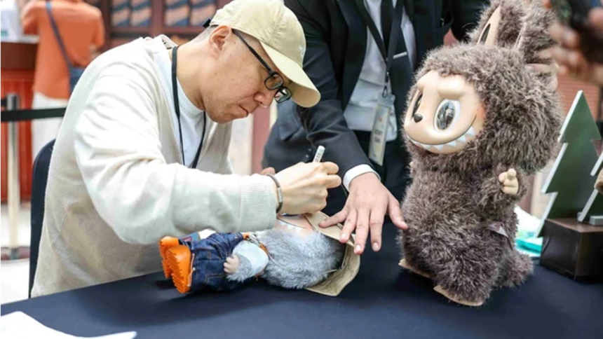
Labubu was created by Kasing Lung, a Hong Kong artist known for his emotional, story-driven approach to illustration. Inspired by folklore, sadness, and the beauty of the imperfect, Lung created The Monsters — a universe of small, expressive beings.
Labubu became the standout figure of that world. Not because it was the most polished — but because it was the most emotive. And Pop Mart’s decision to produce it across dozens of collectible series allowed those emotions to evolve with each drop.
From the pastel softness of Macaron Labubu to the brooding energy of Halloween Labubu, each variant brings a different mood — sometimes joyful, sometimes haunted.
The Role of Visual Asymmetry in Modern Design
The UX principle of friction (and how Labubu uses it)
In interface design, friction isn’t always bad. In fact, small frictions can improve retention: they slow users down just enough to make them engage. The same goes for physical design.
Labubu’s form is never smooth or obvious. Its pose often feels like it’s caught mid-thought. Its proportions, with a huge head and narrow limbs, don’t follow conventional toy balance. And yet — that’s why people stare at it longer.
It’s not a background object. It’s a visual interruption.
Visual weirdness = memory anchor
This is true across media. The fonts you remember aren’t Helvetica — they’re the ones that bent the rules. The illustrations that stay with you aren’t the cleanest, but the ones that made you pause.
Labubu works in that same cognitive space. It may look like a “simple toy,” but it actually teaches an advanced design principle: attention comes from friction, not from polish.
A Small Toy with Big Lessons
Beyond cuteness: building connection through rawness
Labubu isn’t designed to be universal. It’s designed to feel specific. And that specificity — the odd face, the nervous eyes, the imperfect poses — is what creates genuine connection. Fans project emotions onto it. They don’t just buy a character; they adopt a mood.
This is powerful. Whether you’re designing a product, writing a headline, or crafting a UI element — giving people something to interpret makes them more invested. Labubu doesn’t tell you what to feel. It asks you.
From collectible to cultural reference
With hundreds of variants released by Pop Mart, Labubu has quietly become a global icon in designer toy culture. And while some chase it for rarity, many stay for its emotional depth. It’s a reminder that design isn’t just about what looks good — it’s about what feels human.
Want to explore Labubu’s many forms? A curated selection of plush and vinyl editions is available at Labubu Doll.
Lynn Martelli is an editor at Readability. She received her MFA in Creative Writing from Antioch University and has worked as an editor for over 10 years. Lynn has edited a wide variety of books, including fiction, non-fiction, memoirs, and more. In her free time, Lynn enjoys reading, writing, and spending time with her family and friends.