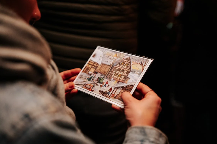
Postcards are among the items people do not just throw away.
Imagine the last time you received a postcard in your mailbox – chances are you picked it up, inspected it, maybe even put it somewhere else in your home because you found it interesting, instead of simply throwing it away.
And that, ladies and gentlemen, is the very reason why companies cannot stay away from them.
78% of consumers prefer receiving postcards over other types of mail, and 60% of recipients visit websites after receiving them. Numbers cannot lie.
The catch is that postcards become interesting enough to get noticed when their design makes them so. It will hardly stand out among many other direct mailing pieces if the picture is boring and the slogan is generic.
Here are seven creative ideas to help your next design do exactly that.
Use a Lenticular Effect That Changes Before Their Eyes
Lenticular printing is the best way to get people to stop and look at your postcard. When you move a lenticular postcard, the images on it change, move, or pop into 3D. This is because of the special plastic lenses used in the card. You can choose between a flip effect that switches between two images, a motion effect that makes it look like something is moving, or a full 3D depth effect that makes your product look like it’s jumping off the surface.
This isn’t just a trick. Research shows that lenticular postcards are ten times more likely to be noticed than regular direct mail, and people are much more likely to keep them long after they arrive.
Let Bold Typography Carry the Design
Not every great postcard needs a complex illustration or a photo spread. Sometimes the most powerful designs center entirely on type. Choose one punchy headline, make it massive, and let the font do the work. The key is contrast: pair a thick, bold typeface with plenty of white space so the eye lands exactly where you want it.
Think of it like a billboard you can hold in your hand. If someone can read your main message in under two seconds without squinting, you have done your job. Keep the rest of the card clean, and let the typography breathe. A single well-chosen color to accent the headline can round out the whole look without overcomplicating things.
Make the Back Work as Hard as the Front
Most postcard designs put all of their creative energy into the front and leave the back for later. That’s a chance that was missed. The back of your postcard is where people naturally turn to read your message, so it’s a great place to put it.
Use it to strengthen the story you’re telling with pictures. The back of your card can keep the same color scheme as the front, repeat a design element, or frame your offer in a bold graphic shape. A clean, well-thought-out back design shows that your brand cares about the little things, and that impression carries over to how people see your offer.
Go Oversized When You Want to Dominate the Mailbox
Size matters more than people realize. Oversized formats consistently earn higher direct mail response rates, and postcards already outperform other formats at 4.25% on average. Going bigger gives your design more room to breathe and makes the piece physically harder to overlook when someone is flipping through their mail.
A 6×9 or 6×11 postcard gives you significantly more canvas than a standard 4×6, and that extra space lets you separate your headline, imagery, and call to action without crowding them together. When your postcard is the largest thing in the stack, it naturally draws the eye first.
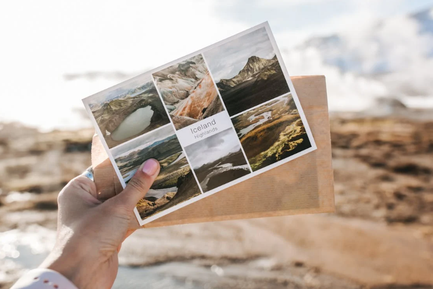
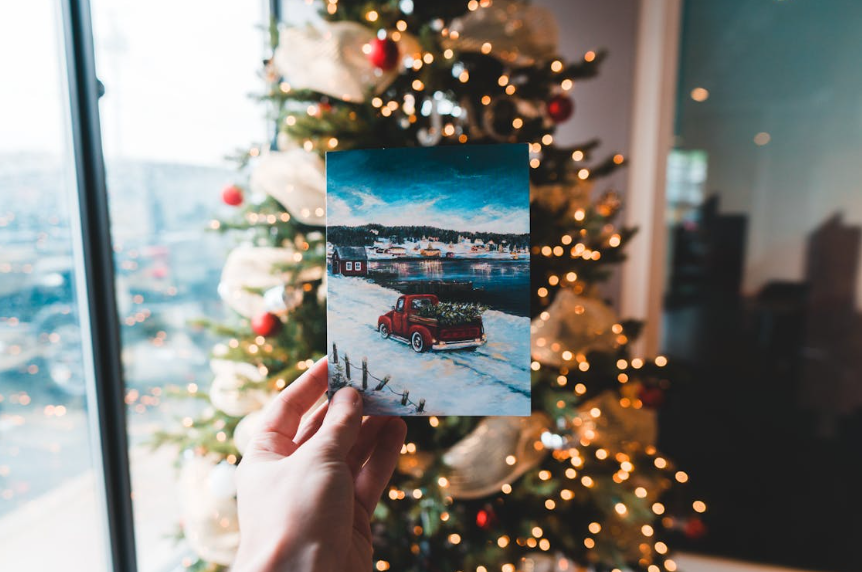
Build Around a Single, Strong Image
When designing a postcard, it’s easy to want to fill every inch of space with text. Don’t do that. A single, high-quality image almost always performs better than a bunch of smaller ones. A single image gives the viewer a clear focus and makes them feel something much faster than a messy layout can.
The picture doesn’t have to be of a product. As long as it clearly connects to your brand and the mood you want to create, it can be a lifestyle photo, an abstract texture, or a graphic illustration. Let it take up space on the card and hold everything else in place. Your offer, headline, and contact information can all fit around that main image without getting in the way.
Personalize Beyond Just Using Their Name
Personalized mail can increase response rates by up to 50%, but personalization does not stop at printing someone’s first name in the salutation. Think about what you actually know about your audience, and let that shape the design.
A real estate company can send a postcard featuring homes in the specific neighborhood where the recipient already lives. A restaurant can tailor the featured dish to match a customer’s order history. A gym can show the class format that aligns with a member’s workout preferences. When the design itself reflects something true about the person holding it, the whole piece feels intentional rather than mass-produced. That is when people pay real attention.
Add a QR Code That Takes Them Somewhere Worth Going
A simple QR code does not make anything creative by itself, but when it goes together with a good design and a truly exciting destination, that becomes another story altogether. Campaigns featuring digital content links or QR codes achieve about 9% higher response rates than those with printed materials only, and the logic behind this is quite obvious.
All you need to do is give your audience a reason to scan. Direct them to a video clip, a webpage offering special discounts, a test, or behind-the-scenes content related to your product or service line. Style your QR code to reflect your campaign’s design by adjusting its colors or placing your company logo right in the middle.
Final Thought
Postcards have staying power that most digital ads cannot match. The designs that work best are the ones that make someone feel something the moment they pick them up, whether that is surprise, curiosity, delight, or a desire to act. Start with one of these ideas, keep the layout focused, and give your audience something worth holding onto.
Lynn Martelli is an editor at Readability. She received her MFA in Creative Writing from Antioch University and has worked as an editor for over 10 years. Lynn has edited a wide variety of books, including fiction, non-fiction, memoirs, and more. In her free time, Lynn enjoys reading, writing, and spending time with her family and friends.