Key Takeaways
- Font size should correspond to the banner’s viewing distance for optimal readability.
- Sans-serif fonts like Arial and Helvetica are recommended for clarity.
- High-contrast color combinations improve text visibility.
- Proper banner placement enhances message effectiveness.
Table of Contents
- Understanding Viewing Distance and Font Size
- Recommended Font Sizes for Various Distances
- Choosing the Right Font Style
- Color Contrast and Visibility
- Banner Placement and Its Impact
- Common Mistakes to Avoid
- Conclusion
Designing an effective banner requires more than eye-catching graphics. The size of your text is fundamental for ensuring your message is noticed and understood. When you consider the right font size for your banner, factors like banner font sizes, viewing distance, color contrast, and font choice all play critical roles. The best banners not only draw attention but also ensure everyone, from across a room or parking lot, can clearly read your message.
If the text is too small or blends into the background, your banner’s purpose is lost. Prioritizing font size and legibility means your message will break through distractions, boost engagement, and leave a lasting impression. With the right strategies, your banner becomes a powerful communication tool in any setting.
Understanding Viewing Distance and Font Size
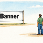
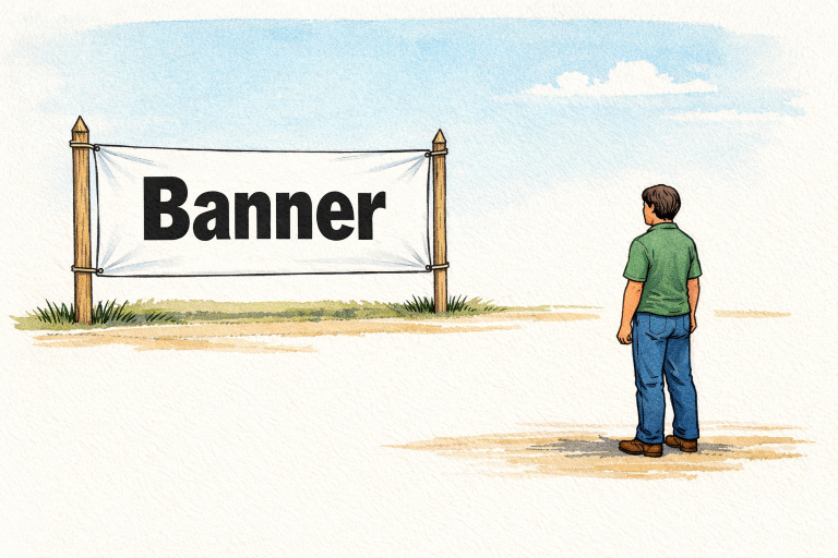
The effectiveness of a banner’s message often hinges on how easily it can be read from a distance. A widely accepted guideline suggests using one inch of letter height for every 10 feet of expected viewing distance. If your banner targets an audience 50 feet away, the text should be at least 5 inches tall. This single rule of thumb ensures your message reaches passersby, making it a standard practice for professionals and organizations alike.
Psychological studies show that the brain processes large, clear lettering far more efficiently than cramped or tiny fonts. Prioritizing this ensures your banner stands out even in busy settings, such as trade shows or outdoor events.
Recommended Font Sizes for Various Distances
Following general recommendations for font size helps guarantee your banner delivers maximum visibility:
- 10 feet or less: 1-inch letters
- 20 feet: 2-inch letters
- 50 feet: 5-inch letters
- 100 feet or more: 10-inch letters or larger
Adhering to these guidelines ensures your text remains legible and that your intended message connects with your target audience across settings, including lobbies, storefronts, event spaces, and outdoor venues.
Choosing the Right Font Style
The choice of font is just as important as its size. Sans-serif fonts, such as Arial, Helvetica, and Impact, provide a clean look that translates better at a distance. Their streamlined design helps prevent crowding and maintains clarity even at larger scales. On the other hand, serif fonts are more ornate and may lose definition when scaled up or viewed from afar.
Using bold or thicker letterforms further increases the impact and legibility of your banner, especially when placed outdoors or against patterned backgrounds. For banner designers, it is best to keep font choices simple and avoid excessive decorative styles.
Color Contrast and Visibility
Strong color contrast between text and background dramatically boosts your banner’s impact. Classic combinations, such as black-on-white or white-on-blue, maximize readability and attract attention. Ensure there is no visual blending between the letter color and the background, as even the largest text can become unreadable with poor contrast.
Consider using your brand’s colors thoughtfully, pairing them for optimal readability rather than for visual overload. Color contrast isn’t just about aesthetics; it is vital for reaching audiences with varying visual abilities, making your message more accessible to everyone.
Banner Placement and Its Impact
Beyond design, strategic placement is essential. Position your banner at or just above eye level whenever possible, ensuring there are no obstacles, such as pillars, doors, or vegetation, in the way. Lighting plays an important role, too; a well-lit banner is visible day and night and during both indoor and outdoor use.
- Height: Mount banners at eye level or above walkways for the maximum field of view.
- Obstructions: Double-check that nothing blocks the main message for any potential viewer.
- Lighting: Use natural daylight or install spotlights to enhance nighttime visibility.
Effective placement ensures your investment reaches the largest audience possible and helps drive results during busy events or in crowded environments.
Common Mistakes to Avoid
Several pitfalls can diminish the value of your banner. To keep your message clear and effective, avoid:
- Overcrowding: Limit text and visual clutter to maintain clarity; a single, focused message is best.
- Low Contrast: Avoid using similar colors for text and background, as this can reduce legibility.
- Inappropriate Font Size: Never use text that is too small relative to the viewing distance. Refer to industry guidelines for letter height at different ranges.
By sidestepping these mistakes, your banner design remains effective and easily communicates its intended message.
Conclusion
Font size is an essential element of banner design, directly affecting how well your message is received. By considering the viewing distance, selecting the right font style, employing high-contrast colors, and ensuring optimal placement, your banner will speak clearly and loudly to every potential reader. A well-designed banner is a dynamic asset that ensures your message reaches and resonates with its audience every time.
Lynn Martelli is an editor at Readability. She received her MFA in Creative Writing from Antioch University and has worked as an editor for over 10 years. Lynn has edited a wide variety of books, including fiction, non-fiction, memoirs, and more. In her free time, Lynn enjoys reading, writing, and spending time with her family and friends.