Color trends in interior design rarely arrive overnight. They emerge quietly, filtered through fashion, art, travel, and the collective mood of the moment. Right now, designers are gravitating toward palettes that feel grounded, expressive, and emotionally intelligent. After years of stark minimalism and cool neutrality, color is slowly making a comeback. The emphasis is on tones that feel lived-in, layered, and connected to the physical world.
What makes today’s most compelling palettes so intriguing is their versatility. They work as enveloping backdrops or as subtle accents. They can feel modern, nostalgic, or quietly radical depending on how they are applied.
Terracotta and Natural Earth Colors
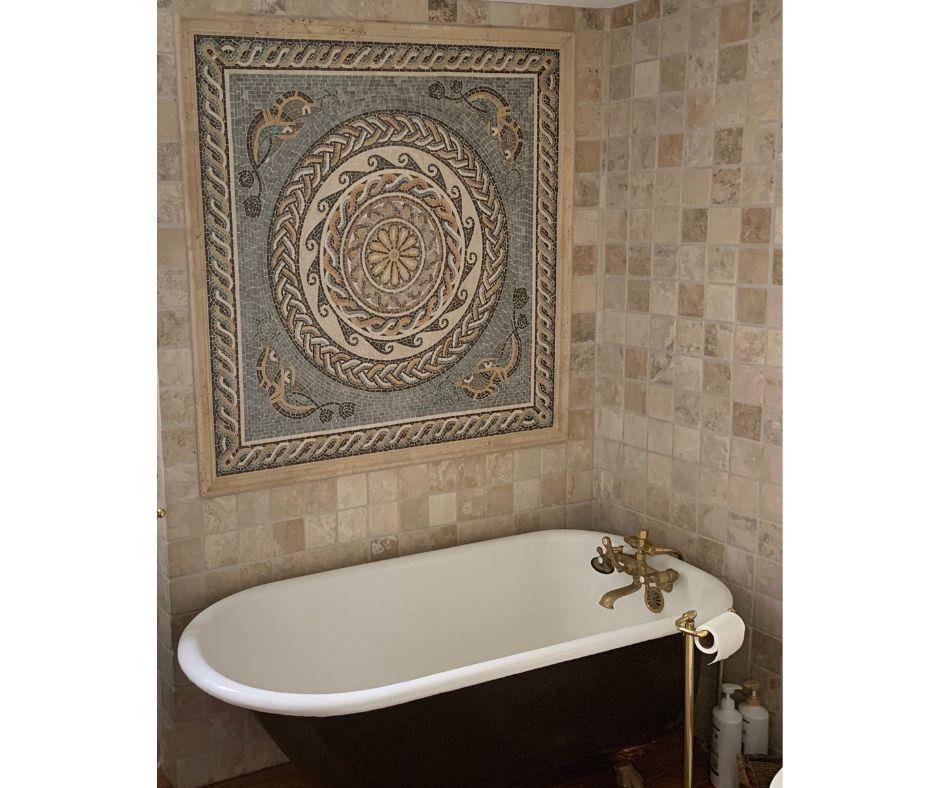
Among the most dominant palettes capturing designers’ attention are terracotta and natural earth colors. These hues feel rooted in the landscape, evoking sunbaked clay, desert stone, ochre-rich soil, and weathered plaster. Terracotta in particular has moved beyond its Mediterranean stereotypes and into a more refined, contemporary expression.
Designers are pairing these tones with materials that enhance their tactile quality. Limewashed walls, raw wood, travertine, and linen amplify the organic character of the palette. In kitchens and bathrooms, earth colors are being translated into surfaces and finishes that feel artisanal rather than glossy or overly processed. This is where details such as a handcrafted mosaic come into play, adding texture and visual rhythm.
What sets this palette apart is its emotional resonance. Earth colors feel stabilizing in an uncertain world. They remind us of permanence, of landscapes shaped over centuries rather than trends measured in seasons – think of a bathroom mosaic in muted clay tones that instantly turn a usual bathroom into a spa-like experience. In urban homes especially, terracotta and its companion shades act as a bridge to nature, offering a sense of retreat without escapism.
Soft Neutrals With Depth
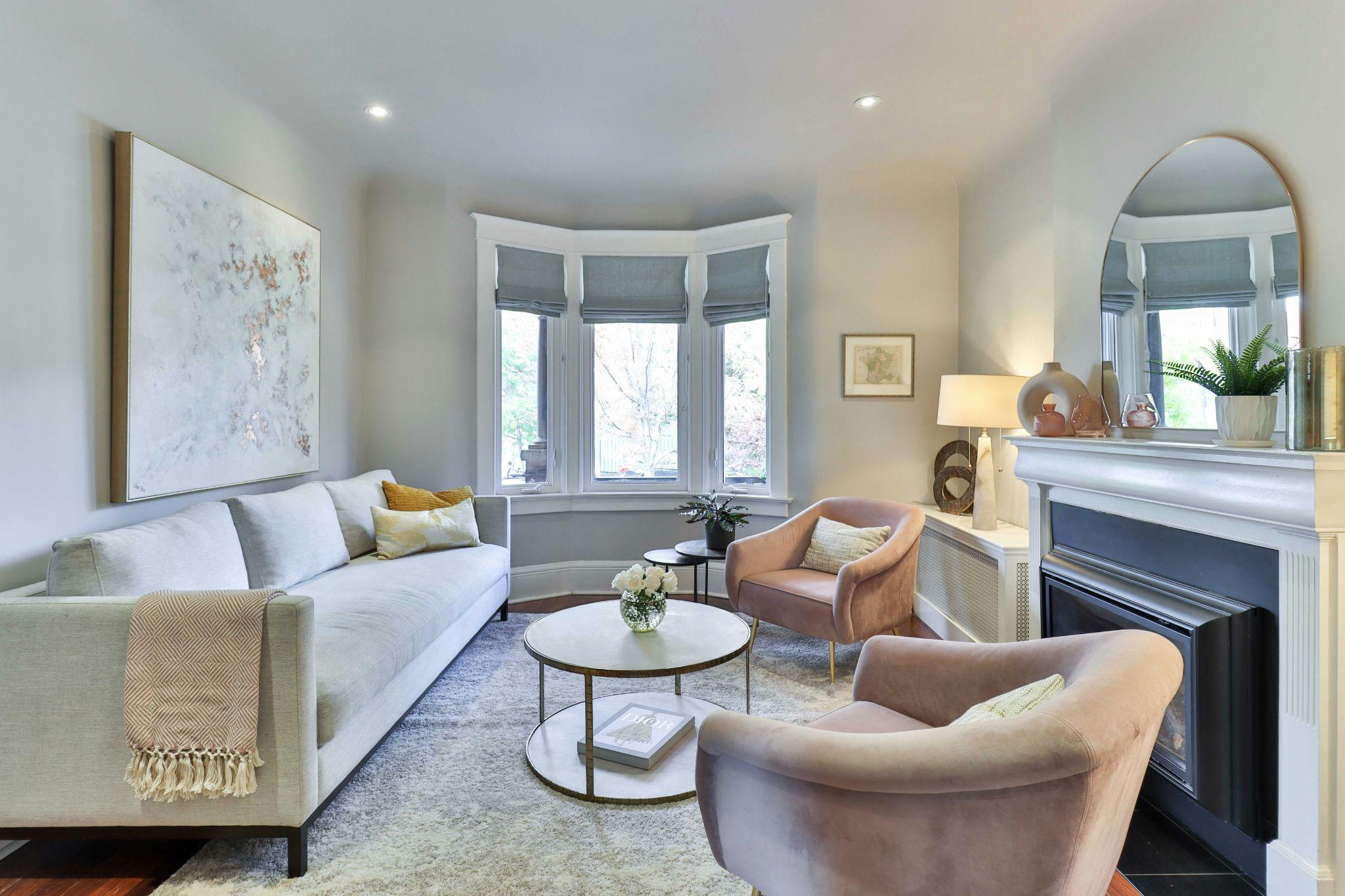
Neutrals have evolved. The crisp whites and cool grays that once dominated interiors have softened into warmer, more complex variations. Think creamy alabaster, pale sand, mushroom, and warm putty. These are neutrals that carry pigment and personality, shifting subtly with the light throughout the day.
Designers favor these tones for their ability to create calm without sterility. When layered correctly, soft neutrals provide a backdrop that allows furniture, art, and architectural details to stand out while maintaining a cohesive whole. They are particularly effective in open-plan spaces, where color continuity helps define flow without the need for visual barriers.
What distinguishes today’s neutral palettes is the emphasis on finish and texture. Matte paints, plastered surfaces, bouclé upholstery, and honed stone prevent these colors from feeling flat. The result is a quiet richness that rewards close attention and long-term living, aligning perfectly with a growing desire for homes that feel personal rather than performative.
Muted Greens Inspired by Nature
Green has long been associated with tranquility, but the shades designers are drawn to now are notably restrained. Gone are the saturated emeralds and jewel-toned statements of previous years. In their place are muted olives, eucalyptus, sage, and mossy greens that feel almost neutral in their subtlety.
These greens work beautifully in both traditional and contemporary settings. They pair effortlessly with wood, leather, and stone, making them a natural choice for kitchens, libraries, and bedrooms. Designers often use them to create a sense of enclosure, particularly in rooms meant for rest or focus. A softly greened wall can make a space feel cooler and calmer without draining it of warmth.
What makes these greens especially appealing is their adaptability. They can read rustic or refined depending on context, and they age gracefully as styles evolve. In a world increasingly concerned with sustainability, green also carries an inherent symbolism, reinforcing a connection to nature and environmental consciousness.
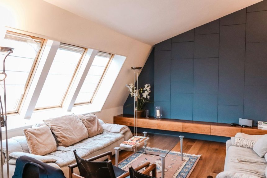
Deep Blues With a Modern Edge
Blue remains a perennial favorite, but the current obsession leans toward depth and complexity rather than brightness. Inky navy, stormy indigo, and blue-black tones are being used to dramatic effect, often in unexpected places. Ceilings, libraries, dining rooms, and powder rooms are all fair game for these moody blues.
Designers appreciate the way deep blue creates intimacy without the heaviness sometimes associated with black. It offers contrast and sophistication while remaining approachable. When paired with warm metals, such as aged brass or bronze, these blues feel luxurious yet grounded.
The appeal of this palette lies in its versatility. Deep blues can serve as a neutral foundation in a maximalist interior or as a bold statement in an otherwise restrained space. They absorb light in a way that enhances atmosphere, making them particularly effective in rooms used in the evening.
Warm Browns and Chocolate Tones
Brown is experiencing a renaissance, shedding its outdated associations and reemerging as a chic, modern color choice. Designers are embracing warm browns, from caramel and chestnut to deep chocolate, as alternatives to black or gray. These shades bring richness and warmth, particularly in spaces dominated by hard surfaces.
Used on walls, brown creates a cocooning effect that feels both sophisticated and comforting. In furniture and cabinetry, it adds a sense of solidity and craftsmanship. Designers often pair brown with lighter neutrals to prevent it from feeling heavy, allowing its warmth to shine without overwhelming the space.
This renewed interest in brown reflects a broader shift toward colors that feel reassuring and familiar. In uncertain times, there is comfort in tones that recall leather-bound books, aged wood, and well-worn textiles. Brown offers a sense of continuity and depth that feels inherently timeless.
Pale Pastels Reimagined
Pastels have been quietly reintroduced, but in a form that feels far removed from their sugary reputation. Today’s pastels are desaturated, complex, and often tinged with gray or beige. Blush becomes dusty rose, mint becomes celadon, and lavender shifts toward smoky lilac.
Designers are using these colors sparingly, often as accents or in rooms where softness is desired. Bedrooms, nurseries, and sitting rooms benefit from these gentle hues, which add color without visual noise. When paired with natural materials and clean lines, modern pastels feel sophisticated rather than whimsical.
The key to their success lies in balance. These shades are rarely used alone; instead, they are layered with neutrals or deeper tones to create depth. The result is a palette that feels light and uplifting while remaining firmly rooted in contemporary design.
Reds That Feel Grounded
Red is perhaps the most emotionally charged color, and designers are approaching it with caution and creativity. Instead of bright primary reds, the focus is on muted, earthy variations such as brick, rust, and oxblood. These shades feel grounded and architectural, lending warmth and drama without aggression.
Designers often use these reds to highlight architectural features or to anchor a space. A rust-toned wall in a dining room can create intimacy, while a deep red accent in a living room adds visual weight. These hues pair beautifully with wood and stone, reinforcing their organic quality.
What makes this palette compelling is its ability to evoke warmth and energy in a controlled way. It acknowledges red’s power while refining it into something more livable and enduring.
Black and Charcoal as Supporting Players
Black has long been a staple in interior design, but its role is evolving. Rather than dominating a space, black and charcoal are being used as supporting players, providing contrast and definition. Designers favor softer charcoals and off-blacks that feel less stark and more nuanced.
These tones are particularly effective in detailing. Window frames, built-ins, and trim painted in charcoal can sharpen a room’s architecture without overwhelming it. In furniture and lighting, black adds graphic clarity, grounding lighter palettes and preventing them from feeling washed out.
The restrained use of black reflects a broader trend toward balance. Designers are less interested in extremes and more focused on creating spaces that feel harmonious and adaptable.
How Designers Are Layering Color
One of the defining characteristics of today’s color obsession is layering. Designers are no longer content with a single dominant hue. Instead, they build palettes gradually, combining related tones to create depth and movement. This approach mirrors the way color appears in nature, rarely flat or uniform.
Layering often begins with a foundational wall color, followed by variations in textiles, furniture, and accessories. Slight shifts in tone create visual interest without disrupting cohesion. This technique allows spaces to feel dynamic and personal, evolving as objects are added or changed over time.
Color as an Emotional Tool
Ultimately, the palettes designers are obsessed with right now share a common goal: emotional resonance. Color is being used deliberately to shape how a space feels, not just how it looks. Warm earth tones provide comfort, muted greens offer calm, deep blues create intimacy, and softened neutrals allow the eye to rest.
This emotional intelligence marks a maturation in design thinking. Homes are no longer treated as static showcases but as environments that support daily life. Color becomes a quiet partner in that experience, influencing mood in subtle but powerful ways.
Lynn Martelli is an editor at Readability. She received her MFA in Creative Writing from Antioch University and has worked as an editor for over 10 years. Lynn has edited a wide variety of books, including fiction, non-fiction, memoirs, and more. In her free time, Lynn enjoys reading, writing, and spending time with her family and friends.